nobody wanted a new logo in last view days. so i created a new one for me. not too many changes. just more ballance between the first and the last char …
NEW

The «y» has now a more solid attitude. It follows the previous char by shape to make a more compact composite.
Below the baseline i wanted to create a more heavy and massive look and feel.
OLD
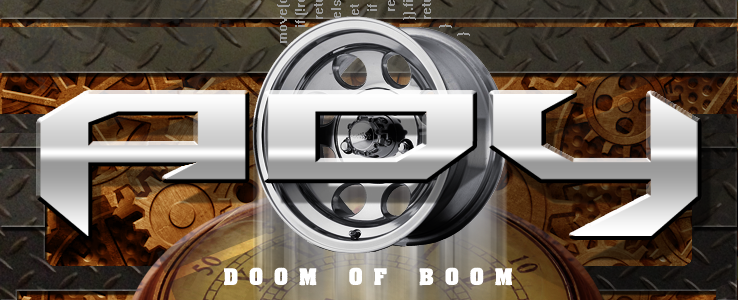
To make it consistent i now am forced to replace the logo in my album’s cover. The title font «DOOM OF BOOM» will get a new font face too later on …